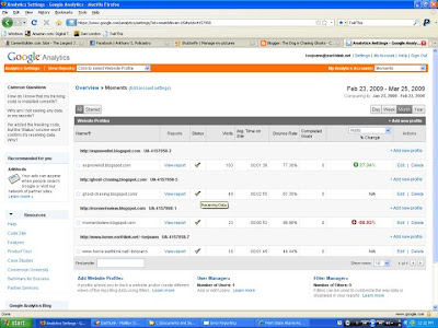
Sign into your account and go to your dashboard which will look like this. I'm tracking several sites so yours may have only one listing.

If you look under the status column you should have a green check mark - that means you successfully installed the Google code and Google is receiving data.
IF you have a yellow triangle you're in trouble, but don't panic. Give the site a few hours and come back later to check it. Sometimes it takes awhile for Google to retrieve the data, figure out it's yours, and place it on your dashboard.
IF you still have the triangle after a few hours, you will have to go back and install the code again. Maybe, you placed it in the wrong area. In any event, Google has a lot of help information so take a look if you get stuck.
Ok, so let's assume you have a nice fat green check mark. Now comes the fun part. Really, I mean that.
Click on the "View Report" link and almost like magic, Google has created an analytics dashboard for you complete with a month's worth of data from the day you open the report. Of course, if you placed your code a few days ago you will see very little data. You can change the date range or make it just one day by clicking on the date.

There's a lot you can do here and you'll have to play with it. I'm just going to highlight what you first see for now because I know your brain is starting to hurt again.
The first element is a nice line graph showing the number of visits by day. This shows you which days visitors decided to come to your site and how many.
The next section is Site Usage. This shows visits, pageviews, pages per visit, bounce rate, average time on site, and the percentage of new visits or visitors. Most of this is self explanatory except maybe bounce rate. This shows the percentage of visitors who stayed less than 10 seconds. That means they found your site, glanced through it and left - they were not interested. A higher bounce rate will tell you something on the site is driving your visitors away. Ideally, you want a low bounce rate.
The average time on site tells you just that - how long the average visitor stayed. If the average is over a minute or so you can assume they liked what they saw and read something there.
The last metric tells you the percentage of new or first time visitors. Obviously, you want this to be high because it will indicate that whatever you are doing on other sites, it is driving traffic to your site. But, a high visits number and a low percentage of first time visitors will show the majority of your visitors are loyal and make repeat visits.
![]() Image via CrunchBase
Image via CrunchBase
Ok, are you passed out yet? Just a few more metrics to cover and you're off the hook.
Visitors Overview on the left is just that, but the Map Overlay is really cool. Click on any country in dark green and it will show where your visitors are from by country and by state or region. I find most of my visitors are from my home state and that makes perfect sense since most of my friends and relatives are here.
The last two sections are highly valuable in determining what's working and what is not on your site. The Traffic Sources Overview will show you cool metrics like the percentage of direct traffic (visitors type in your site address), the referring sites (where you have links on other sites to your site), the search engines used to find your site and the keywords visitors used in those search engines. All valuable information that will tell you how effective you are in driving traffic to your site.
The Content Overview tells you which content on your site is getting the most visits or interest. This is great for blogs because it will tell you which post is getting read the most and you can determine what subject matter the majority of your visitors like best. It is also valuable for multiple pages on a web site to determine the most interesting pages.
You can also customize the dashboard to show different reports if you don't like the default offering, and you can easily export any report to a PDF, CSV, XML or TSV file in addition to emailing them.
I think that's enough for now. Go pass out.
![Reblog this post [with Zemanta]](http://img.zemanta.com/reblog_e.png?x-id=e0275103-1acc-474e-8911-6ca4fdc9247a)
No comments:
Post a Comment
We welcome your comments. Thanks for visiting!